Because finding a seat shouldn't be work.
Snug is a high-fidelity iOS app and vendor dashboard that lets students and remote workers find, browse, and claim a seat at nearby cafés and libraries in under 60 seconds. It came out of a real campus frustration, an 8-month design process, and 13+ user testing sessions — closing the gap between unpredictable physical spaces and the confidence to commit to one before you ever leave the door.
Breaking navigational friction.
Shared spaces — cafés, libraries, coworking spots — are unpredictable by nature. Availability shifts by the minute, so there's no way to know what you're walking into before you arrive. Students and remote workers spend 6 to 18 minutes per session hunting for a seat, and a staggering 70% walk into a space, find it full, and leave without ever sitting down.
The language in interviews was strikingly consistent — seat searching was draining, demotivating, stressful. So I moved the problem earlier in the journey and focused entirely on the decision window before arrival: an option reliable enough to act on, but simple enough not to create new friction.
How might we give students and remote workers visibility into seat availability — before they ever leave the door?
The guiding design question
Contextual inquiries and real constraints.
I ran 10 interviews and 5 usability sessions around UBC. Seat searching came up again and again as a routine source of stress. But talking to café managers at Kafka and Blue Chip surfaced the other half of the problem: guaranteed seating creates real operational risk for them during peak class hours.
That framed the core constraint — anything I built had to solve for two people at once: the student trying to work, and the vendor protecting their margin. No static forecasts, no baseline data that couldn't keep up with real-time seat turnover.
Shift the decision to before the user leaves home.
Solve for the student and the business owner's margin.
No static forecasts that fail to adapt to fast turnover.
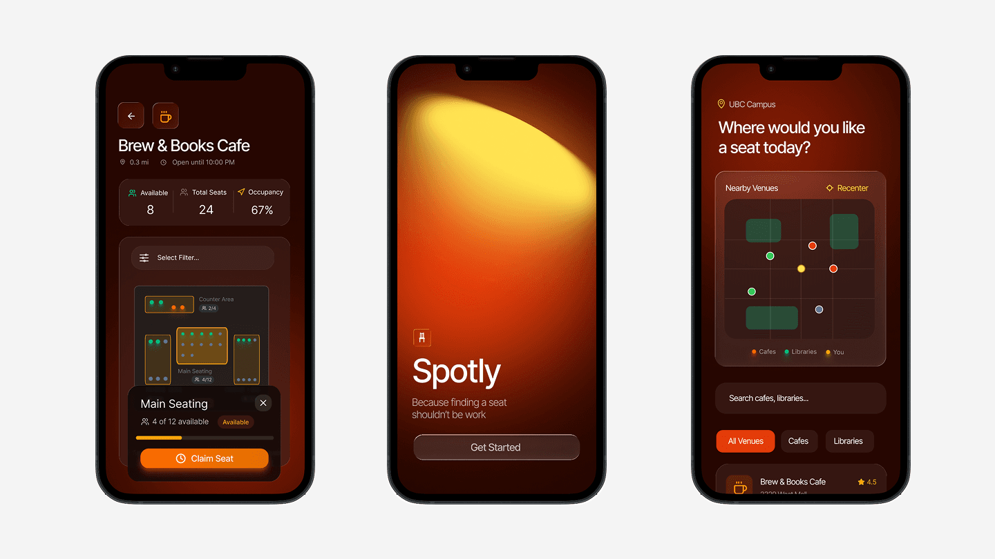
Iteration 01: Spotly.
I brought the vision to life as a lo-fi prototype called Spotly — live seat visibility on a map, with a micro-booking flow to lock down a zone before leaving campus. Then I ran five usability sessions with the same task: find a café, check availability, claim a spot.
The concept landed instantly — all five understood it without guidance. But two failures showed up fast. Users hesitated 4 to 7 seconds before pressing claim, exposing a deep lack of trust in the system. And relying purely on colour to signal availability meant people couldn't tell an open seat from a nearly-full one.
All 5 participants grasped the core concept with no guidance.
A 4-to-7 second hesitation before claiming exposed low trust.
Colour alone couldn't separate available from limited seats.
From friction to flow: the Snug pivot.
Spotly proved that speed alone wasn't enough — a colour-coded map couldn't build trust. Snug was built to close that gap: turning unpredictable floor plans into a baseline of certainty, with deep environmental context, explicit booking contracts, and a seamless hand-off from search to arrival.
I mapped every usability roadblock directly to a high-fidelity fix. The result is a live environmental dashboard where users spend just 30 to 60 seconds securing a workspace before they leave their dorm or classroom.
A single high-visibility ticket that establishes trust upfront and kills the hesitation before commitment.
Sort by noise, lighting, and outlet density instead of generic geographic dots.
A flat 15-minute grace period replaces ETA math at the point of commitment.
Plain-language mechanics: the hold fee applies directly to your café purchase.
Anatomy of Snug.
The final interface is built around four moments: seeing what's open, understanding a space, committing to it, and arriving with confidence.
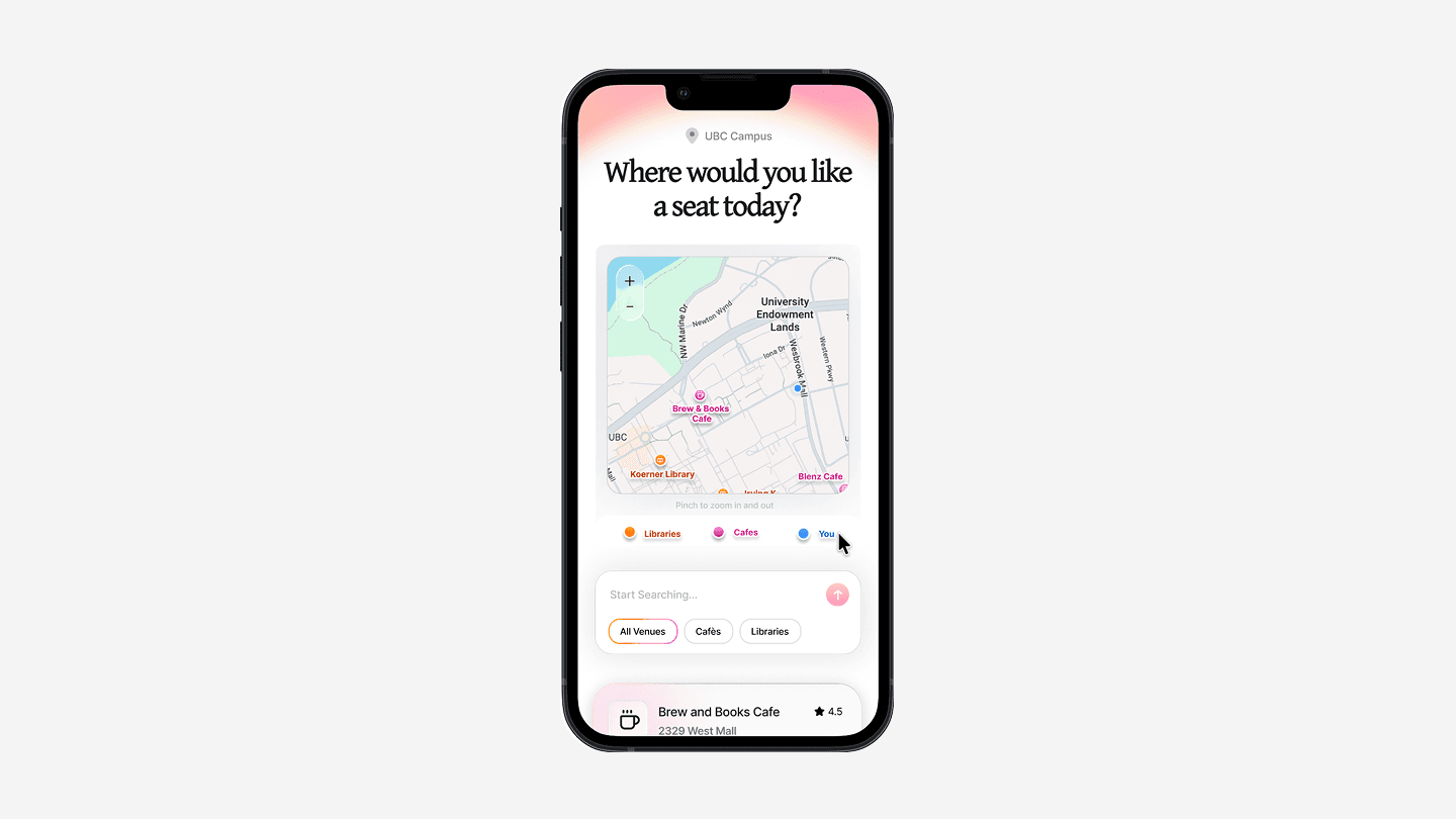
The Contextual Map
I turned a stressful campus map into a live environmental dashboard — lightweight by design, showing absolute capacity instead of ambiguous coloured dots so you can read availability while walking or multitasking.
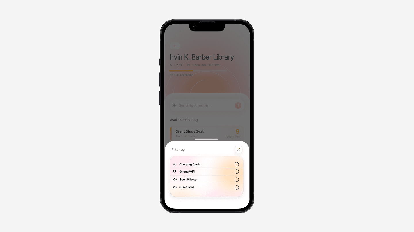
Venue Insights
A bite-sized workspace wellness check. Instead of dense paragraphs or floor plans, conditions are shown as scannable cards — micro-occupancy charts, plus clear iconography for Wi-Fi, outlets, and seating types.
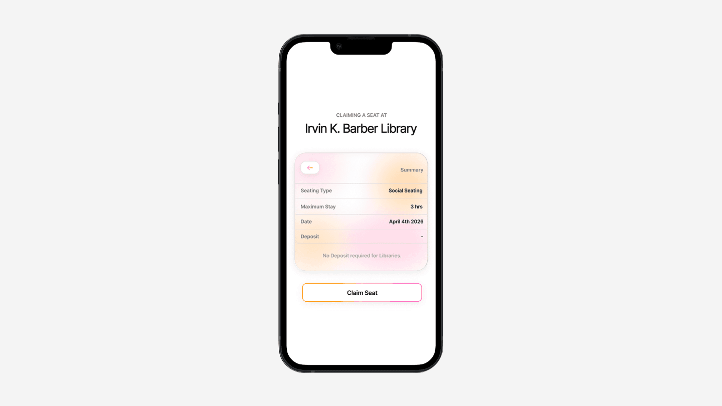
The Booking Flow
The critical moment of commitment, rebuilt to remove the hesitation seen in Spotly. Clear typography explains the deposit, flat buffer windows replace ETA math, and the layout guides straight to the primary action.
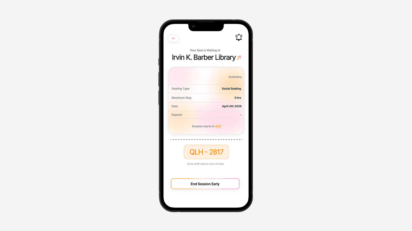
The Summary Card
The answer to the trust gap — an active ticket that works like a digital handshake between student and vendor. Framing it as a receipt leans on behavioural familiarity, and a high-contrast live timer always shows exactly how long you have to claim your spot.
The other half of the ecosystem.
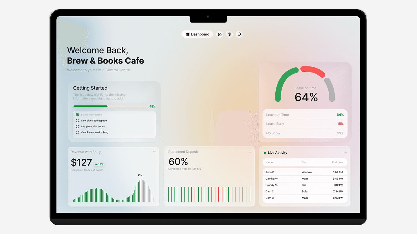
Snug is a two-sided platform. For the live map to stay accurate, venue owners need a frictionless way to manage capacity — so I designed a low-effort control centre that empowers café staff instead of burdening them. High-contrast cues and large tap zones let a barista update a table in a single glance.
Designing both halves kept the incentives honest, and it unlocked real business value: guaranteed revenue from converted deposits, predictable foot traffic from the incoming queue, and — longer term — aggregated campus data as a B2B opportunity with universities.
Real-time status of every seat: open, reserved, or occupied.
Mark a table available the moment a student leaves, synced to the app.
A chronological list of students who hold a seat and are en route.
From Spotly to Snug.
Turning a flawed prototype into a working ecosystem taught me the real value of bridging digital interfaces and physical space. The baseline map was a foundation, but real-time context and explicit trust mechanics were what moved it from a simple campus map to a viable, monetization-ready product.
The biggest lesson: assuming users wanted speed over context in the first iteration drove high abandonment. Real people need certainty before they'll commit to a commute. Recognizing that — and being willing to rethink the whole interaction model — was the hard part, and the one that mattered most.