The work that never became a case study.
Marks, characters, posters, and prototypes made between the bigger projects. No process, no problem statement, no research plan — just the things I made because I wanted to see if I could. Hover any piece for the short version.
Marks, systems, and the things they live on.
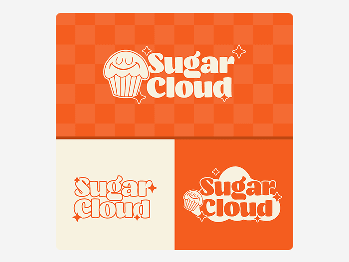
A soft, playful identity for a bakery — warm oranges, a checkered pattern, and a mark that works from a storefront sign down to a cupcake sticker.
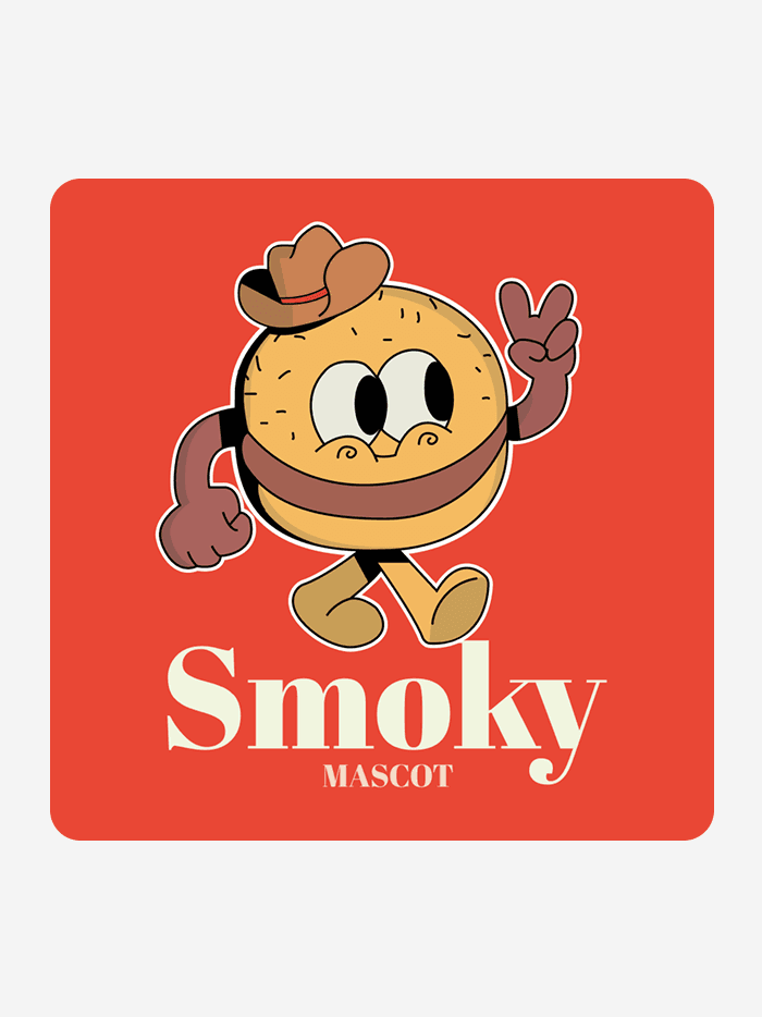
A retro-cartoon mascot for a burger brand, built with bold outlines and a 1930s rubber-hose feel.
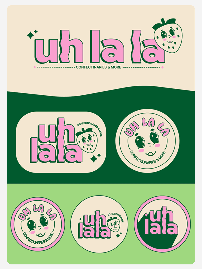
A confectionery brand with a full sticker system — every variant of the mark built to survive being slapped on a box, a bag, or a window.
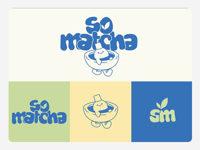
A clean, energetic identity for a matcha bar, with a flexible mark that scales down to a two-letter monogram.
Faces, forms, and a lot of turnarounds.
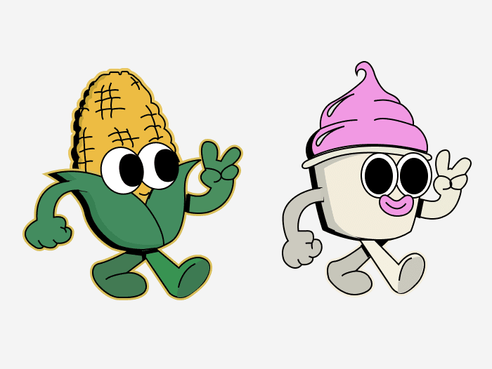
Two food characters with rubber-hose limbs and a lot of attitude — an exercise in giving personality to objects that don't have faces.
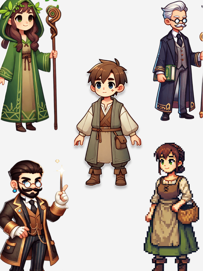
A full RPG cast — cleric, rogue, wizard, merchant — each silhouette designed to read instantly at a glance.
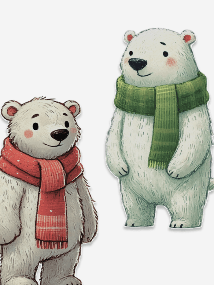
Character studies for Polar Panic. Soft, hand-drawn, and built to make a survival game about melting ice feel warm rather than bleak.
Type, ink, and one very large grid.
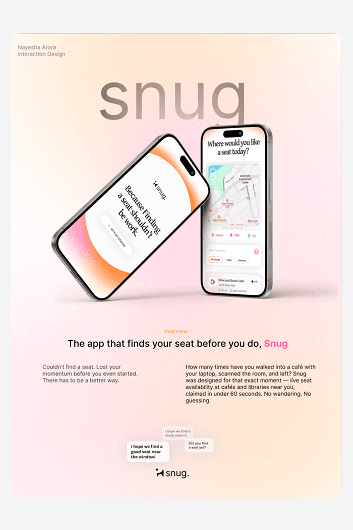
A promotional poster for the Snug app — the pitch compressed into a single frame.
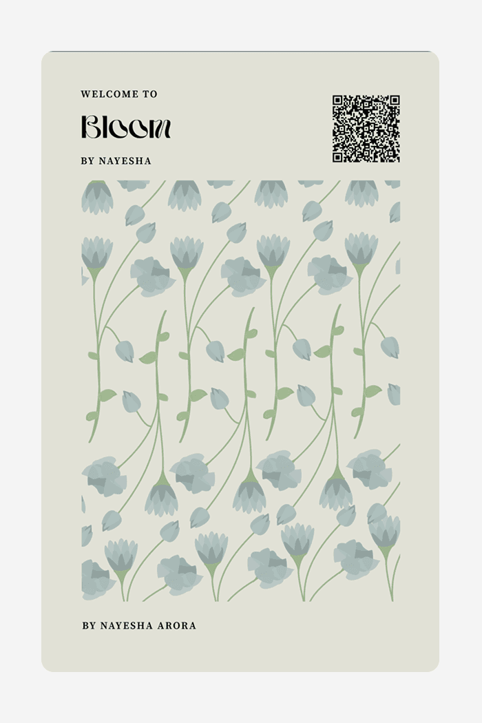
A botanical print piece — restrained palette, delicate linework, and a lot of whitespace doing the work.
Half-built ideas worth keeping.
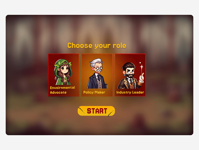
A character-select screen for a climate decision game — pick an activist, a policy maker, or an industry leader, and the whole game changes.
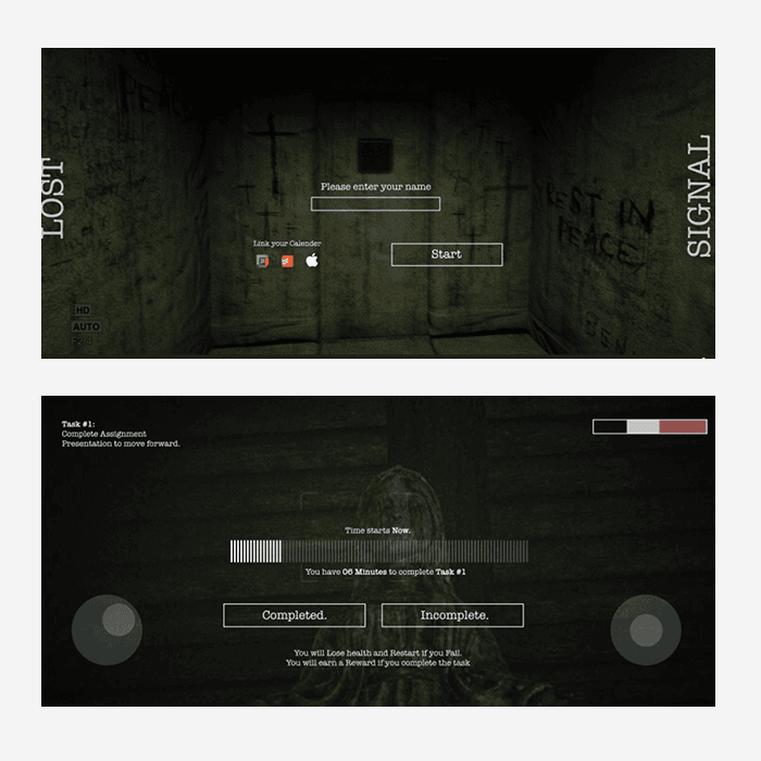
A moody, dark interface experiment — an interactive fiction concept built around atmosphere and restraint.
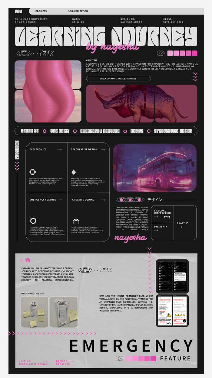
A full case-study board mapping an interface from research through to final screens.
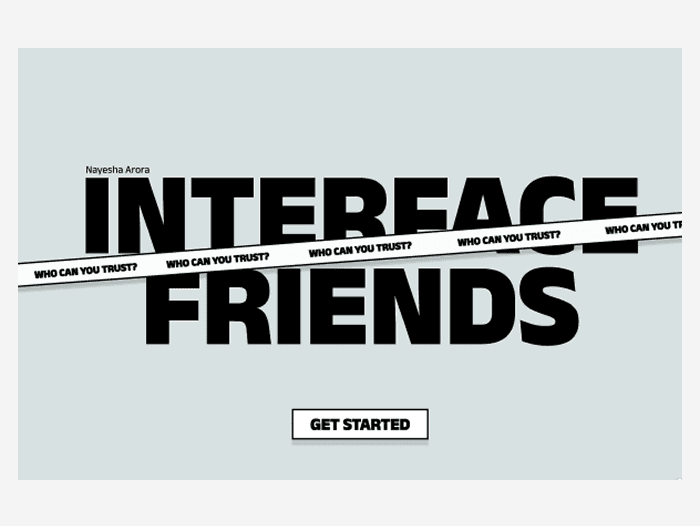
A bold type-driven landing page — high contrast, one typeface, and a single call to action.